
My website has had a bit of a going over recently, I've changed layout and text, added buttons, and removed broken links. Also added some guest comments directly to the apartment page from our Holiday Rentals reviews.
I've got some new photos to take on our next visit, particularly as the interior shots are starting to look a bit tired (or they are to me), and things have changed since they were taken. Some ideas for these would be appreciated.
Opinions on my website revamp please.
-
Hells Bells
- Posts: 13173
- Joined: Sat Apr 30, 2005 8:42 am
- Location: French Alps
- Contact:
-
Hells Bells
- Posts: 13173
- Joined: Sat Apr 30, 2005 8:42 am
- Location: French Alps
- Contact:


Well done Helen on a great website!
I'm no expert, so I'm looking at this as a potential guest. There is lots of information, but in small chunks, broken up with photos, so it isn't information overload.
It's made easy for guests to book and find out your rates because of the link on every page. I find it a very "user-friendly" site and your great reviews would have anyone rushing to book!
Two comments
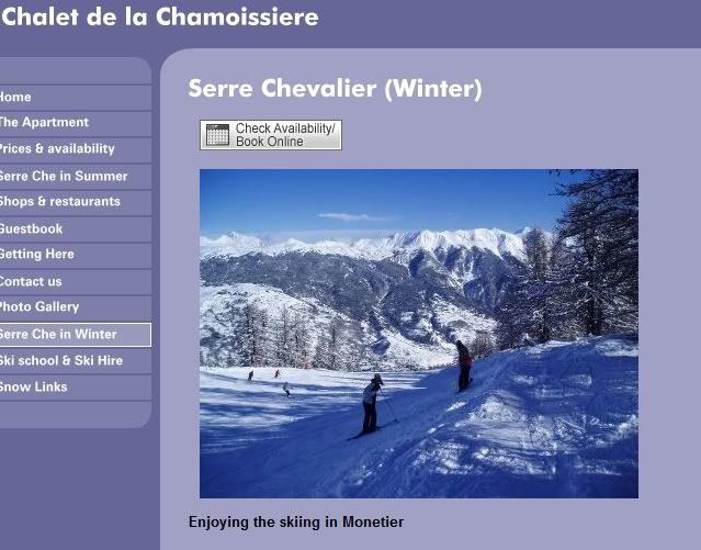
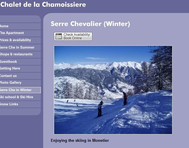
1. On the home page, the link to the Serre Che Winter page (between the two photos) didn't work for me. Other links work fine.
2. When I exited from looking at photos on picasa web, I had exited your website! Maybe I pressed the "wrong x", but I did it twice and it would be a shame to lose potential guests this way!
You have put a lot of work and thought into this site, well done you!
I'm no expert, so I'm looking at this as a potential guest. There is lots of information, but in small chunks, broken up with photos, so it isn't information overload.
It's made easy for guests to book and find out your rates because of the link on every page. I find it a very "user-friendly" site and your great reviews would have anyone rushing to book!
Two comments
1. On the home page, the link to the Serre Che Winter page (between the two photos) didn't work for me. Other links work fine.
2. When I exited from looking at photos on picasa web, I had exited your website! Maybe I pressed the "wrong x", but I did it twice and it would be a shame to lose potential guests this way!
You have put a lot of work and thought into this site, well done you!
If you always do what you've always done then you'll always get what you've always got.
Apartment Mil Palmeras
Apartment Mil Palmeras
-
Hells Bells
- Posts: 13173
- Joined: Sat Apr 30, 2005 8:42 am
- Location: French Alps
- Contact:
-
Hells Bells
- Posts: 13173
- Joined: Sat Apr 30, 2005 8:42 am
- Location: French Alps
- Contact:
Polly, I agree about the terrace shot being crowded. One of the ones on my list to be retaken. The other ones I have make it look bare too.
We've bought some new loungers and I am off to Ikea in a moment to buy some planters to hook onto the wooden screen. A few geraniums will soon make it nice. I'm thinking of some herbs too. Suggestions from Alpine property owners as to what will survive the winter?
We've bought some new loungers and I am off to Ikea in a moment to buy some planters to hook onto the wooden screen. A few geraniums will soon make it nice. I'm thinking of some herbs too. Suggestions from Alpine property owners as to what will survive the winter?
I was using Internet Explorer. I have Firefox also, tried it there and same thing happened!
If you always do what you've always done then you'll always get what you've always got.
Apartment Mil Palmeras
Apartment Mil Palmeras


I liked it very much...especially the 'logo' of sun and snowflakes. I'd carry that through to all your correspondance too.
The photos are comprehensive and through them I felt I got to know every area of the property. I also liked the information you had on the local area...as Maurmc said, all in bite-sized chunks. Plus the way you allowed your 'guests' to sell us the place.
Mouse
x
The photos are comprehensive and through them I felt I got to know every area of the property. I also liked the information you had on the local area...as Maurmc said, all in bite-sized chunks. Plus the way you allowed your 'guests' to sell us the place.
Mouse
x
One martini, two martini, three martini floor!

As if. Helen, your location is amazing and your website multi-layered and rich in content, so it's difficult to know where to start. But, wearing my photograper's hat, I wondered whether we'd still be talking if I opened up the shadow detail a little in the four lead pictures and knocked out some of the cold bluish cast? Here goes ...No-one with anything to say?


All this stuff is subjective, of course, and you may prefer the original shots.
Jim
-
Hells Bells
- Posts: 13173
- Joined: Sat Apr 30, 2005 8:42 am
- Location: French Alps
- Contact:
Since you didn't like Jim's top one, here's another way to "improve" a photo without using photoshop.
I haven't touched the colour of the photo, but compare these:
BEFORE:
AFTER:
I haven't touched the colour of the photo, but compare these:
BEFORE:
AFTER:
** Richard
PIMS: Holiday Rental Management system
They say we learn from our mistakes. That makes me a genius !
PIMS: Holiday Rental Management system
They say we learn from our mistakes. That makes me a genius !
