Page 1 of 1
Website Review Please
Posted: Thu Dec 08, 2016 9:09 pm
by Felicanda
Hi All.
I'm new to the forum, but have been gleaning some excellent advice from all the posts on here.
I've been renting a property in Saint Gervais for about a year now and have just revamped the website from one created on promote my place to a different provider. I've only had one booking from the old website, most business comes through airbnb.
I'd be grateful for any feedback anyone has on the new design
The mobile version formatting is messed up a little bit and I know I need to rebuild the website to sort this out.
Thanks in advance
http://www.skiapartment-st-gervais.com/
Posted: Thu Dec 08, 2016 9:57 pm
by greenbarn
Hi Felicanda and welcome to LMH.
You might want to move your post to the Website Reviews section where you’re more likely to get reviews on your website.
Posted: Thu Dec 08, 2016 11:09 pm
by Ben McNevis
Hello Felicanda - and welcome!
I think your apartment looks great and it's a great temptation for our Easter 2018 ski holiday!
Looking at the pictures and description, it is quite a big apartment but you say it is for 4 people and I found that surprising. It sounds like there are beds for 7 and the dining area seats 10. So if you only want to allow smaller groups to use it because you want to limit the wear and tear, then I think you should explain that.
On first loading the page (I'm using a laptop), it was slow. Second time it was fast. So, there are some big pictures loading which were cached enabling fast loading the second time. You will always see it load fast but it was a bit painfully slow the first time. Having a look at the detail, you've got some background images for a splash screen. Actually 2 images get loaded but only one is visible. The images are:
http://www.skiapartment-st-gervais.com/ ... 746865.jpg (visible, size=2000x1500)
and
http://www.skiapartment-st-gervais.com/ ... ult-bg.jpg (invisible, size=2000x1333)
And I wonder whether you really need that splash screen at all.
Apart from that, it seems to be all there.
Posted: Fri Dec 09, 2016 8:06 am
by Felicanda
Ben
Thanks for the reply, I didn't realise both photos were loading. I'll certainly sort that out.
The reason for the splash screen is that I'm currently working on a French language version accessed through the same screen. If it's nugatory at the moment though I'll certainly think of getting rid of it until required.
Thanks for the nice words about the apartment. I'll think about writing something about the numbers, your right 7 people could stay, I think my intention is to be a comfortable spacious family apartment.
I tried to work out how t move the post to the right section but failed miserably. Could a moderator please to the honours for me?
Posted: Fri Dec 09, 2016 10:42 am
by e-richard
Ben McNevis wrote:Looking at the pictures and description, it is quite a big apartment but you say it is for 4 people and I found that surprising.
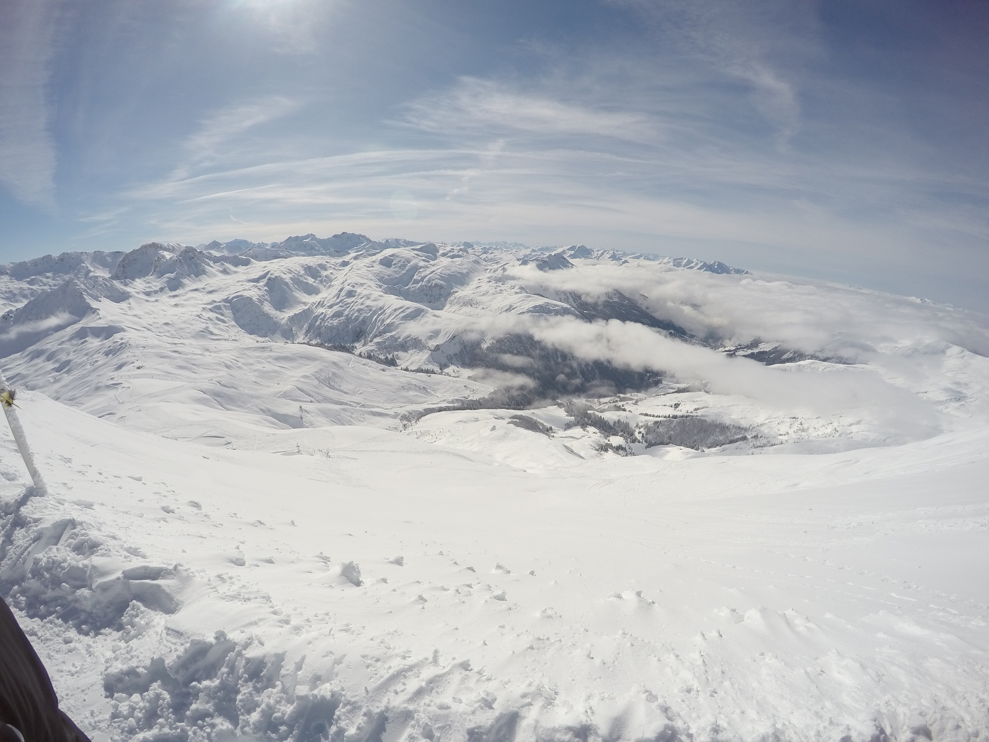
Oh, the hazards of a very wide angle lens

After I'd read your comment I also spotted that the apartment is 75m2 which is about right for 4 adults. Not excessive.
I like the website. Its minimilist but perhaps could have done with a few more pictures of the apartment itself (internal or external)
as well as pretty views and artistic shots.
On the front page, and elsewhere, there is the easily seen call to action button "Make a booking", but that (potentially disappointingly) leads to a simple "enquiry form".
Posted: Sat Dec 10, 2016 10:16 pm
by brightmike
The property looks nice but I don't think the wide-angle photos with the wonky walls do it any favours. I would also put a bit of a border around the text in the white box to make it a bit easier to read.
Good luck!