Page 1 of 2
Finally upgraded my site......
Posted: Tue Jan 23, 2018 3:50 pm
by KathyG
After 12 years I've finally moved away from Dreamweaver, I'm trying out Wix and am finding it so much more user-friendly and intuitive than DW although it does have a few minor limitations.
I'd be grateful if someone would have a look and give me an honest review and also let me know which device you're viewing it on. I'm a bit worried that Wix sites are a little slow to load.
New Wix site
Old DW site
Posted: Tue Jan 23, 2018 7:14 pm
by e-richard
Wow, you've clearly put in a lot of work here. I do like the site. And I like the little text boxes dotted around. Lots of info but not thrust at you in reams and reams of text.
Personally I found the little shaded lifted up corners a bit overbearing, but then I am going through my minimalist phase where simplicity reigns supreme.
I'm also not really a fan of Wix. Its a bit buggy if you're not careful.
The Reviews page for example at certain window widths goes wonky. On my laptop, Win 10, big screen if you resize the window horizontally narrower and narrower then at some point it goes wrong.
Hope this is clear.
I can email a screenshot if you need it. Photobucket is letting me down for posting a pic
Posted: Tue Jan 23, 2018 7:36 pm
by KathyG
Thank you so much for looking at it Richard! Too many lifted up corners, I'll try diluting them with some normal boxes

.
Why would you resize your window though Richard?? Yes screenshot would be great but not sure I'll be able to do anything about it.....!

I really didn't get on with Wordpress unfortunately.
Posted: Tue Jan 23, 2018 7:54 pm
by e-richard
I have emailed the screenshot to you.
Its not that one may resize the screen, but that its at that size when you open the website. Not everybody has every screen maximised.
Sorry, but the geek in me usually has 8-10 different screens open and I'm moving them about a lot. e.g. When reviewing your website, one i looking at the site and also writing in LMH. Its often useful to try and see as much of both windows as you can. A good responsive website will adapt to this.
Posted: Fri Jan 26, 2018 7:39 am
by KathyG
e-richard wrote:
The Reviews page for example at certain window widths goes wonky. On my laptop, Win 10, big screen if you resize the window horizontally narrower and narrower then at some point it goes wrong.
Thanks for the screenshot Richard, sorry I've taken so long getting back to you!

How can I replicate this on my Mac, haven't been able to find any way of resizing the screen......
Posted: Fri Jan 26, 2018 8:01 am
by e-richard
Sorry Kathy, a Mac is something for keeping the rain off my back. That's all I know.
Posted: Fri Jan 26, 2018 9:38 am
by KathyG
Pah!!

I couldn't go back to anything other than a Mac now!
I understand what you're doing now, will see what Wix have got to say about it. You're right, that shouldn't be happening but it only seems to happen on the Reviews page for some reason.
Info
Posted: Fri Jan 26, 2018 3:32 pm
by VillaAntonioLanzarote
Hi
What a step change !
You must be pleased with what you now have in place
We are Wix users to , we like it a lot
Might want to try the Wix "Review" App , if the page is causing a problem
Only thing I would add is a Contact page plus a contact form I think we use one called POWr , which can be found in the Wix App marketplace , it is free
You can see our contact page below if you like
http://www.villaantonio.co.uk/contact
Overall - excellent[/url]
Posted: Fri Jan 26, 2018 6:17 pm
by KathyG
Thank you Villa Antonio! it's been a big learning curve but nowhere near as steep as Wordpress which I really couldn't get on with. Much much easier than Dreamweaver!
I had a look at your site too, looks great, reminded me I need to finish off my floorplan that I started about 5 years ago! You have masses of gadgets!!

I've tried fixing the Reviews page and can't, so I'll have a look at the Reviews App, thank you for that tip, there's a huge amount of Wix magic that I haven't even looked at yet. I hadn't thought of a Contact page, might have a look at doing one of those too.
Thanks again
Posted: Fri Feb 02, 2018 12:15 am
by Annew
Hi Kathy .... hope you are well! Haven't had a reply to any emails so guess they may be languishing in your spam box!
Your new website looks really good ... hope to get back to your place one of these days (do let me know if your neighbour decides to sell - we are thinking of packing up here in Devon soon and may be looking for a second home.....

)
Posted: Fri Feb 02, 2018 5:10 am
by KathyG
Annew wrote:Hi Kathy .... hope you are well! Haven't had a reply to any emails so guess they may be languishing in your spam box!
Oh no!! I thought you were ignoring me
I'll pm you, see if that gets through......
(Nothing in my spam folder either)
Thinking of giving up? We keep saying that too, getting too old for all this and it's definitely been harder get bookings this year.
Posted: Wed Feb 07, 2018 5:18 pm
by KathyG
Spent an afternoon with my brother last week who spends half his life designing websites. So the verdict: Well it looks like you did it in Word. I don't like the text boxes with the turned up corners. Too much distracting 'stuff' going on in the background. Too cluttered. Gave me a headache. Not enough white space. Don't like the layout.
I was not a happy bunny after that onslaught!!
However I put my big girl's pants on and re-did it. He lent me a book on website design called "Don't make me think". Very helpful. So for those who had a look please could you look again - I've only re-done the Home page so far...... Richard you'll be pleased that there are no text boxes with lifted up corners now.
 Here's the link
Posted: Wed Feb 07, 2018 6:03 pm
by e-richard
That's a very smart brother. He knows what he is talking about. Maybe a bit insensitively, but he is your brother so gets away with it and I can see the improvements. But you still need to listen harder.
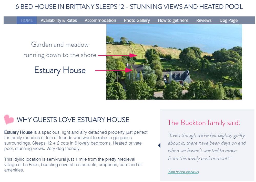
LESS IS MORE
Just take a look at this part of the page.
7 different Fonts in this snippet alone. 3 is absolute Max on the whole page.
You don;t need those arrows and all the minute detail right up front on the main page. It confuses your main BIG message.
The headline "200m from the water" says it all and is all thats needed to caption the picture. MAYBE put a grey circle around Estuary House, but its not really necessary here.
The next segment on the page with your photo gallery and captions to the right is a great example of simplicity and elegance. It just works !!
Just because you asked for comments, here are two ideas for this gallery:
1) A block of centered text is considered harder to read. Think about left ranging the captions. Right ranged is not a good idea.
2) If you can, adding a 1 pixel border in mid (not too dark) grey on each photo will really make them stand out more. But don't overdo it. 1 pixel max.
Just some ideas and hopefully you see the direction its headed....
Posted: Wed Feb 07, 2018 6:48 pm
by KathyG
Oh blimey!! Seven fonts? Really? Will go and check, thought I'd sorted them.
I did think it was a bit messy with the arrows but wanted them to get the message that that was their bit of land too.
Will do all your other recommendations and see what it looks like......
Posted: Wed Feb 07, 2018 6:57 pm
by KathyG
4 fonts!
