newbie website

Get some feedback on your site or ad from other rental owners and techies. Also a library of online resources so you can make DIY improvements to your web presence.
tribalecho
Posts: 13
Joined: Tue Aug 05, 2008 4:44 pm
Location: Paimpol, France
Contact:

newbie website

Post by tribalecho »

We bought our house in Brittany last November, but only recently started to advertise it, after having completed a bit of work on it.
I'd appreciate useful comments and suggestions, although I know my french is probably terrible - so reviews of just the english pages would be good!
Thank you :)


http://www.yvias.net
TTP mk2
Posts: 1020
Joined: Tue Mar 25, 2008 10:15 pm
Location: Guingamp/Bourbriac in Brittany
Contact:

Post by TTP mk2 »

Welcome to LMH

My initial impression of your site is that it looks very dated, the new/current HTML spec is for 'clean' white sites

More specificly:

On my 1024 x 768 screen the home page looks as it finishes just below the top row of buttons

It's only when you scroll down, you see the rest of the information & there sure is a lot of that, IMHO far too much for one page particulary as a lot of it is duplicated on other pages

It would be nice if the area photos were labeled, apart from the alt tags

I'll leave others, more knowledgeable than I, to comment on the pictures but,
Summer pictures would be better than winter ones
Interior pictures would be better with open shutters & natural light
"Rules are for the guidance of wise men and the obedience of fools."

Group Captain Sir Douglas Bader
tribalecho
Posts: 13
Joined: Tue Aug 05, 2008 4:44 pm
Location: Paimpol, France
Contact:

Post by tribalecho »

Thanks for that Nick - it looks like I'm going to have a busy weekend!
I guess it might be better to spread the information over more pages then. It's only now when I look at other people's sites that I see what you mean :)
I'd appreciate any other comments before I set to work on it!
Thanks again
e-richard
Posts: 5008
Joined: Sun Oct 17, 2004 11:33 am
Location: Algarve, Portugal
Contact:

Post by e-richard »

Pretty much agree with everything Nick has said above, so I'll only add to that:

You do need to work quite hard on site organization and navigation. Its currently a bit messy and "all over the place". Rather than proscribe a particular solution for you, I do suggest you look at a number of other examples of holiday rental sites, and you'll see some patterns emerge and some ideas to help you.

The sort of problems I encountered are:
Menu point says: House info and photos
Page contains lots of photos. Then after a lot of scrolling, you see "Nearby Markets", then some details on the house (house info), interspersed in there are some booking info on deposits and payments, then some completely unrelated info on Ferries.
Clicking on the French menu point in order to see that page translated into French, takes you to the French HOME page.

I don't want to sound too destructive, but this requires a lot of work, and I suggest you just use pencil and paper to map it all out, and while doing that consider the following:
  • Make it easy for people to find what they are looking for.
    Ensure that each page stands on its own, but the visitor can get from there to all other info.
    Remember each visitor will wander around the site in a different way. You cannot write it like an essay with a beginning, middle and end. A website is just a series of separate entities connected by style, look, and a good navigation system.
Good luck, and I look forward to seeing the fruits of your labours.
** Richard
PIMS: Holiday Rental Management system
They say we learn from our mistakes. That makes me a genius !
User avatar
cottageguru
Posts: 301
Joined: Fri Jul 27, 2007 1:04 am
Location: Ontario, Canada
Contact:

Post by cottageguru »

Hi Tribalecho

My goodness you have a ton of useful information on your site. It has just about everything I would want to know if I had no experience of your part of the world. The information could be organised a bit better as it is a little overwhelming, and it could cause people to get distracted too early on in the viewing process. They would then click away and may not come back again.

e-richard's idea of taking a pencil and paper to map it out is a good idea. When I am trying to organise this much info I use mind mapping to sort it all out, but that doesn't suit everyone, I know.

I do have a comment about your bedroom photos. Although your living/dining/kitchen photos are attractive and inviting, you may want to review how the bedroom pics portray those rooms. When I look for accommodation, I pay a lot of attention to the bedrooms - after all that's where my family are going to spend a lot of time. It doesn't sound much but it's amazing what a difference a few pictures/prints on the walls can make. Attractive bedding - cozy looking quilts and pretty pillows - all add to the overall welcoming effect.

When I was doing up some of my cottages, I got inspiration from looking at other people's sites and also by googling 'boutique hotels'. You can find some terrific ideas for staging bedroom photos on those.

You have a lovely place and it can only get more inviting with the improvements you are planning on making.
Heather

Vacation Rental Success Podcast
www.cottageblogger.com
www.twitter.com/cottageguru
goosie
Posts: 408
Joined: Mon Mar 10, 2008 1:47 pm
Location: Cotswolds

Post by goosie »

Welcome!

My comments are similar to others, but I hope that helps reinforce their importance.

Generally, I think you have got the pitch about right in terms of information about the house and area - it looks very good so these comments are in the spirit of a good start!

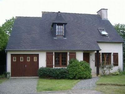
Pictures - it may not be possible to redo them but you should try to have ones of the house in full-sun and preferably the summer time. The interior photos are clear but the house looks a bit stark in places. I don't know if you live near by but if you could add some flowers/pictures or ornaments in some of the rooms that would help brighten them up - otherwise I found myself looking at photos of a bed with a cover on!

Prices - I may have just missed them, but I couldn't easily find the prices. I find that the order that people look at our website after the first page is photos, availability and prices so they need to be clear.

Split the pages - I agree with others that there is too much on one page and you could just add other pages (if your webhost allows that without additional cost!).

Finally, personal view but I find the orange on blue background a bit down market whereas your property clearly isn't that. I know a number of the advertising sites use orange as their main colour but to be truthful that has put me off advertising with some of them! Having said that, I recognise that colours on screens appear differently for different users but on aol it is coming up as turquoise and ryan-air orange.

I hope these are constructive as I think it is a very good start which just requires tweaking! Good luck
tribalecho
Posts: 13
Joined: Tue Aug 05, 2008 4:44 pm
Location: Paimpol, France
Contact:

Post by tribalecho »

Thank you for taking so much time, and for all your helpful comments and suggestions - and for the nice ones too :)
I've obviously got my work cut out this weekend - and far beyond!
I don't live nearby (well, not that far, but it is a ferry ride away - I'm in Guernsey), so can't change the photos for 3 weeks or so until I go back there, but I think I'll start with re-organising the site for now, and gradually work on the rest.
Thanks again
e-richard
Posts: 5008
Joined: Sun Oct 17, 2004 11:33 am
Location: Algarve, Portugal
Contact:

Post by e-richard »

Nah, you don't really have to catch the ferry.... you could cheat !

From your website:
Image

On the Photoshop ferry:
Image
** Richard
PIMS: Holiday Rental Management system
They say we learn from our mistakes. That makes me a genius !
tribalecho
Posts: 13
Joined: Tue Aug 05, 2008 4:44 pm
Location: Paimpol, France
Contact:

Post by tribalecho »

Wow - that's great!
Do you think I can use it on the website? I'm not very good at photo editing, but maybe I should buy Photoshop and have a go. Would you mind me using what you've done?
That really does make such a difference - it's not until I see it that I realise how good the house can look :)
e-richard
Posts: 5008
Joined: Sun Oct 17, 2004 11:33 am
Location: Algarve, Portugal
Contact:

Post by e-richard »

I don't see why you cannot use that picture on your website...
** Richard
PIMS: Holiday Rental Management system
They say we learn from our mistakes. That makes me a genius !
kirkland
Posts: 279
Joined: Thu Jan 17, 2008 12:11 pm
Location: North West Cumbria
Contact:

Post by kirkland »

Like the others I would say you`ve got all the info, you just need to get it off you front page. We use drop down menus, that saves a lot of space. Also, put some furniture and a bottle of wine in the garden, maybe even some people enjoying themselves.
User avatar
Garri
Posts: 1689
Joined: Mon Jul 11, 2005 7:26 pm

Post by Garri »

TTP mk2 wrote: My initial impression of your site is that it looks very dated, the new/current HTML spec is for 'clean' white sites
Though I agree the site looks dated, I'm not sure that white is the new or current 'spec'. The current trend in website design suggests different:

http://www.webdesignerwall.com/trends/2 ... gn-trends/

We're seeing a lot of textures and grunge styles, and retro, though they're all still clean and fresh despite their busyness.

For what it's worth, Tribalecho's site is a whole better than some I've seen. At least most of the keypoints are above the fold and the site does well to convey the important information on one page. I think that's actually the way forward, though it could benefit from a better design. So could my own site before anyone starts shooting ;-)
User avatar
Alan Knighting
Posts: 4120
Joined: Mon Oct 18, 2004 7:26 am
Location: Monflanquin, Lot-et-Garonne, France

Post by Alan Knighting »

Tribalecho,

Joan wants to live by the sea and she has decided that Brittany is where she wants to be. Your Website has confirmed her conviction.

Alan
TTP mk2
Posts: 1020
Joined: Tue Mar 25, 2008 10:15 pm
Location: Guingamp/Bourbriac in Brittany
Contact:

Post by TTP mk2 »

Garri wrote:Though I agree the site looks dated, I'm not sure that white is the new or current 'spec'. The current trend in website design suggests different:

http://www.webdesignerwall.com/trends/2 ... gn-trends/

We're seeing a lot of textures and grunge styles, and retro, though they're all still clean and fresh despite their busyness.
Sorry, I was mis-quoting something I read about 'Web 2'

Looking at the sites on the above page, I noticed that none of them had a plain coloured background, they were all grapics or white, which is what I meant
tribalecho
Posts: 13
Joined: Tue Aug 05, 2008 4:44 pm
Location: Paimpol, France
Contact:

Post by tribalecho »

Well, I've been slaving over a hot laptop, and have got this far
http://www.cwgsy.net/private/yvias/
I haven't replaced the old site yet, just playing with this one.
The contact form doesn't work, so I'm going to replace it with one that doesn't need a cgi-bin (whatever that is!)
I know it could probably still do with some editing, but I hope I'm going the right way :)
And I haven't even thought about a French version yet! :shock:
Post Reply