Poor Thomas, we've confused you - and here's another idea to put into the melting pot. I understand you wanting a bit of interest going on in the background, so shrinking the existing wallpaper was one idea, and then there's this sort of approach ....
http://www.crerarhotels.com/
I love this!

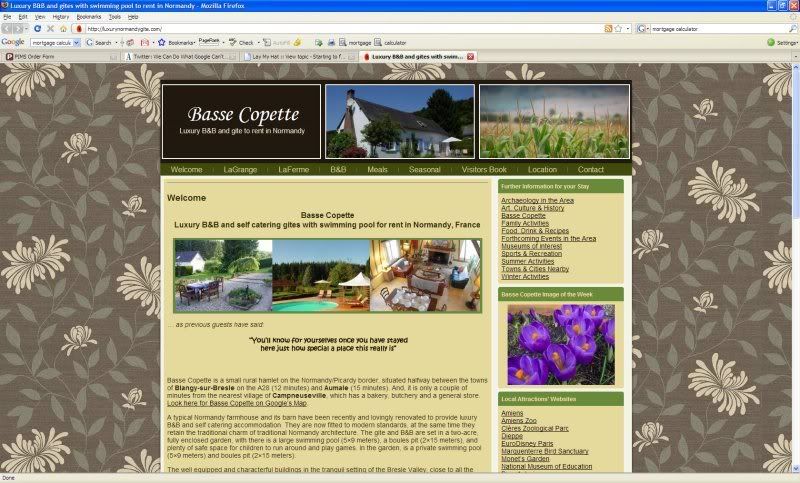
I think the whole colour scheme works together really well. On reflection, yours doesn't - it doesn't clash but nor does it really co-ordinate as successfully as this home page does; I just love the menu bar, and the way the font matches the brown background.
With just a bit more experimentation you could do the same,as you're very nearly there. What you have now is a nice tasteful home page: "pleasing", but it could go from that to being something very classy and professional! Seriously stylish.
I think the owner of Crerar hotels has kind-of made it easier for himself in that the background is essentially one colour, but it's relieved by that watermark effect. Having a plainer background of course then makes it easier to mix other colours with it. The whole scheme is therefore simpler, and "less is more" as they say.
Some here would argue "why bother?" but heck, if you have the wherewithal, you might as well go for the best you can produce. Will it get you more bookings? I'd argue "possibly"! You're selling an image - you've chosen to include the word "luxury" in your domain name after all.