
Would anyone like to review Updown Cottage please!
-
Giddy Goat

- Posts: 9054
- Joined: Sun Jun 12, 2005 7:38 am
- Location: UK
- Contact:

Alan, I didn't see it as a misunderstanding but like you say, it is charitable of you to see it that way 
About designing above the fold (ATF) websites: take a look at this site for some inspiration: http://www.briol.it/index.html
Nice layout and brilliant photography make this a very good example of a ATF site, good navigation too.
That said, their contact (reservation) form is a pop up so not exactly ideal but at least it follows some conventions such as a 'proper' submit button and even a clear button if you get stuck.

Garri - what a beautiful site. I think it has done all that JC wants to do and has the clear functionality that folks here wanted without comprimising the colour scheme or the classy feel of the site. I could afford this perhaps - and Bauhaus - I love it!
P.S I was going to put a smiley face but the emoticons have disappeared
P.S I was going to put a smiley face but the emoticons have disappeared
-
Mountain Goat

- Posts: 6070
- Joined: Wed Apr 19, 2006 1:31 pm
- Location: Leysin, Alpes Vaudoises, Switzerland
- Contact:
All a bit toe-curling for me.
Beware, selfish thread creep coming up:
I wouldn't mind playing around with the same (freebie?) DreamWeaver template which this site is based on - InsideBegin. Unfortunately Google searches bring up hundreds of sites based on the same template. Is there a way of not searching the Code View with Google? Or have I got it wrong - is InsideBegin a DW or Java jargon term? If so I'll get my coat. But, if not, is there anywhere I can download the template?
Garri - Does ATF only refer to sites without vertical scrolling? Or does ATF refer to the part of the site which is ATF?
MG
Richard, I always refer to sites like the Briol one as above the fold because other than the scrolling of content within the frame there's no scrolling on the actual browser. Other sites which having browser scrolling usually make sure their chief calls to action and of course main navigation are always above fold.Garri - Does ATF only refer to sites without vertical scrolling? Or does ATF refer to the part of the site which is ATF?
Not sure which template you're referring to. I checked the Briol source code and couldn't see any reference. Is it a freebie template then?
-
Mountain Goat
- Posts: 6070
- Joined: Wed Apr 19, 2006 1:31 pm
- Location: Leysin, Alpes Vaudoises, Switzerland
- Contact:
Oh OK.
Be careful with it though. Personally the Briol site works better than Updown, not because it's navigation is better, but because of its use of photography in the design. The updown site by comparison shies away from selling the place through photography, other than the splash page.
If you're going to go down the ATF route it is much more of a design challenge than meets the eye, particularly if you have a lot of content
-
Mountain Goat
- Posts: 6070
- Joined: Wed Apr 19, 2006 1:31 pm
- Location: Leysin, Alpes Vaudoises, Switzerland
- Contact:

Okay, I know I'm jumping in rather late... and I hesitate to bring this up, but...
I don't think the contact form thing is a Firefox issue. Here's why:
I'm using Firefox (in Linux), and I haven't unticked anything, or messed with my settings...
...so clearly this is only a problem for some people and not others. Of course, that doesn't make it any less an issue, since a large enough fraction of us have the problem that this form may be preventing a large fraction of inquiries.
But, JC, if you don't want to change the input fields to e.g. green on white instead of white on green, then I suggest you do at least two things:
I hope I haven't re-opened the can of worms or anything, but it seems clear that this is a more tricky cross-browser compatibility issue than just "Firefox/No Firefox". I may be able to read the form input, but I have other viewing issues: the bottom menu is not in the right place. So, there is something else going on with the CSS.
I'm surprised the white-on-white issue can't be solved by specifying the highlight color with CSS, so that whether people have or have not checked a certain settings box doesn't matter.
Garri, thanks for that interesting hotel link. I love the way they've handled the clickable photos.
I don't think the contact form thing is a Firefox issue. Here's why:
I'm using Firefox (in Linux), and I haven't unticked anything, or messed with my settings...
...so clearly this is only a problem for some people and not others. Of course, that doesn't make it any less an issue, since a large enough fraction of us have the problem that this form may be preventing a large fraction of inquiries.
But, JC, if you don't want to change the input fields to e.g. green on white instead of white on green, then I suggest you do at least two things:
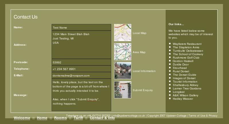
- 1) Make the "Submit Enquiry" text also clickable -- my first impulse was to click that to submit and it doesn't go anywhere. This is "mystery meat navigation" in that you have to intuit where to click, but you could just add an <A> tag around the text that calls submit with javascript, and it would no longer be a guessing game.
2) Add a bit to the "Contact Us" title - just a few words pointing out the submit "button."
I hope I haven't re-opened the can of worms or anything, but it seems clear that this is a more tricky cross-browser compatibility issue than just "Firefox/No Firefox". I may be able to read the form input, but I have other viewing issues: the bottom menu is not in the right place. So, there is something else going on with the CSS.
I'm surprised the white-on-white issue can't be solved by specifying the highlight color with CSS, so that whether people have or have not checked a certain settings box doesn't matter.
Garri, thanks for that interesting hotel link. I love the way they've handled the clickable photos.
Brooke
Brooke, it's even more of a shambles than I first thought
I wouldn't waste your time as JC seems to have taken her ball and run off sulking.
The design decision to make the field text area green to match the site is also a bad one. It could've been a lighter green, or white (god forbid!) and the text in the fields could've been same green as background. Result = it would show up in FF on the yellow background AND tie in with site.
It's a good job I wasn't brutal in my critique 'cos god knows how she would've reacted
Anyway, if JC is still lurking then take some of the advice you solicited and pimp your site. Your delightful cottage deserves better so treat it with some respect.

At the risk of extending the side discussion about solving the problem technically, I actually found the answer in the page that was referred to by JC herself.
http://www.htmldog.com/ptg/archives/000 ... #comment32
Illustrates how to resolve the problem with CSS.
By the way, I think the background colour problem is only a Google Autofill issue, not a browser brand issue. Brooke has identified a separate browser related issue with the navigation.
Oh dear - I do hope JC takes these issues on board for the sake of her customers. Its a pity to spoil an otherwise well designed site because of the vagueries of technology that different visitors may use.

I don't use firefox and I had the highlight problem yesterday. Today the highlighting has gone and I can see what I'm typing. I can assure you that I did not alter anything in my browser as basically I dont have the foggiest what that was all about. 
I would like to say that the knowledge provided in this forum from you all has helped my Edinburgh site immensely. I am proud to say that it is now in the top 13 results for a popular google self catering search which offers over 1 million results. Cheers.
I would like to say that the knowledge provided in this forum from you all has helped my Edinburgh site immensely. I am proud to say that it is now in the top 13 results for a popular google self catering search which offers over 1 million results.
Richard, it's not just the CSS or the Google Autofill but the form itself is bad from start to finish.
It doesn't tell me which fields are mandatory because there's no room in the design to afford that guidance. Why does the form need my address and postcode? Pointless. Get rid of those fields and free up the space to accommodate a conventional submit button.
This site is not an art piece where it can get away with bucking certain conventions. JC is not Yugo Nakamura!