Page 5 of 5
Posted: Wed Mar 04, 2009 4:52 pm
by Thomas BC
I really like the wallpaper (not my discovery though), and I always thought given that you do not get to see much of it it would not be too much of a distraction. But given the overwhelming consensus - it will have to go. Although I like it I do not have strong feelings about it being on the website.
I have been changing the order of the sidebar elements all day, so I welcomed Brooke's suggested ordering

Still looking into removing the word 'welcome' - its part of the wordpress way of things. I was delighted when I saw that comment. But that is not something I can do myself - that is deep in wordpress coding.
Richard, you could not find that information because its not there

It disappeared in the re-structuring and I am just trying to figure out where to put it.
Regarding the Paypal link going into French, I have raised this here before:
viewtopic.php?t=8324
Its a pain, and would dearly like to resolve it. So if anyone has managed, please put me out of my misery

Posted: Wed Mar 04, 2009 5:19 pm
by vrooje
I don't find the wallpaper too distracting at all, but I really like Martha's idea of toning down the wallpaper without completely eliminating it. That would keep the style of the site and hopefully ensure that the wallpaper wasn't as distracting.
Still looking into removing the word 'welcome' - its part of the wordpress way of things. I was delighted when I saw that comment. But that is not something I can do myself - that is deep in wordpress coding.
I had a similar problem with my WP site (unrelated to the field of holiday rentals). I ended up manually changing the code to add a blurb right at the start, something that's actually helpful from an SEO perspective. I understand if you don't want to do this, though.
Posted: Wed Mar 04, 2009 5:41 pm
by Blue Shutters
I like the wallpaper, it would be too much if more were visible.
So don't change that! But who am I to know......

Posted: Wed Mar 04, 2009 6:04 pm
by e-richard
I acknowledge that the wallpaper issue is probably a matter of taste, and more to the point is hardly going to affect the vast majority of users with the most common 1024 X 768 screen size.
I just thought you may like to see what it looks like on a wide screen monitor, maximized:
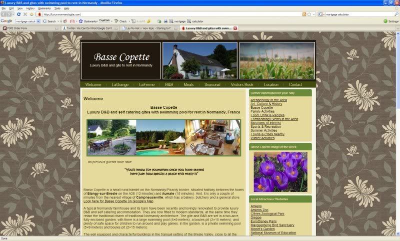
Not too many folks will see this much.
Posted: Wed Mar 04, 2009 6:21 pm
by Giddy Goat
Yes, that's how it looks on the Mac here - Martha's soluion would work very well. Try it first Thomas before ditching it altogether?
Posted: Wed Mar 04, 2009 6:27 pm
by Normandy Cow
elena wrote:Ditto - I'm not keen on patterned backgrounds - I find them too busy, but since it's all a matter of personal taste I hesitated to say on my last post.
Blue Shutters wrote:I like the wallpaper,
Just goes to prove that you can't please all of the people all of the time! So you might as well please yourself - if you like it Thomas, I don't think people are going to decide not to book with you because they don't like the wallpaper!
You could end up going round in circles forever now if you listen to all our suggestions! Just pick out the important ones, the ones that could affect your seo or booking decisions, and then leave the less important cosmetic issues to your own personal choice, something that you like.
Look how far you have come in the past couple of days! What an improvement (of something that was already pretty good anyway!).
And always bear Voltaire in mind: "Le mieux est l'ennemi du bien"
Now go out, take a rest from the computer, and have a nice relaxing drink!
Posted: Wed Mar 04, 2009 8:01 pm
by elena
Just goes to prove that you can't please all of the people all of the time! So you might as well please yourself - if you like it Thomas, I don't think people are going to decide not to book with you because they don't like the wallpaper!
You could end up going round in circles forever now if you listen to all our suggestions!
Exactly, NC!
Elena
Dordogne holiday cottages
Posted: Wed Mar 04, 2009 9:03 pm
by Giddy Goat
Poor Thomas, we've confused you - and here's another idea to put into the melting pot. I understand you wanting a bit of interest going on in the background, so shrinking the existing wallpaper was one idea, and then there's this sort of approach ....
http://www.crerarhotels.com/
I love this!
I think the whole colour scheme works together really well. On reflection, yours doesn't - it doesn't clash but nor does it really co-ordinate as successfully as this home page does; I just love the menu bar, and the way the font matches the brown background.
With just a bit more experimentation you could do the same,as you're very nearly there. What you have now is a nice tasteful home page: "pleasing", but it could go from that to being something very classy and professional! Seriously stylish.
I think the owner of Crerar hotels has kind-of made it easier for himself in that the background is essentially one colour, but it's relieved by that watermark effect. Having a plainer background of course then makes it easier to mix other colours with it. The whole scheme is therefore simpler, and "less is more" as they say.
Some here would argue "why bother?" but heck, if you have the wherewithal, you might as well go for the best you can produce. Will it get you more bookings? I'd argue "possibly"! You're selling an image - you've chosen to include the word "luxury" in your domain name after all.
Posted: Wed Mar 04, 2009 10:08 pm
by Thomas BC
Posted: Tue Mar 10, 2009 5:14 pm
by catherinedonegal
thomas: well done on the site and all the improvements.
a couple of things i noticed:
le grange - when i click on the living room to enlarge it i get error 404 message.
and when i click on either of the properties' bedrooms i am taken to a comment page.
---------
normandy cow: when i clicked on your video link it wouldn't work for me?